The failed academic logo a year later: what went wrong?

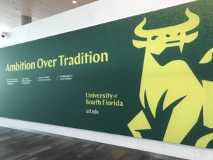
During her fall address on Sept. 5, 2018, now-former USF president Judy Genshaft unveiled a new academic logo as the university entered a new era.
“Do you love it?” Genshaft enthusiastically asked the crowd at the Marshall Student Center ballroom.
She received a positive reaction then, but it became apparent quickly the rest of the USF community hated it.
But why? Why did something as mundane as a logo cause such drastic backlash?
It wasn’t necessary and made things more confusing
USF could have saved itself a lot of headache had it just adopted the ‘Iconic U’ for academics. Not just from the community backlash, but with the implementation process itself, considering USF had been using USF Athletics’ logo for marketing purposes for several years prior.
While using an athletic brand for academics is not common, it’s not unprecedented. The University of Miami adopted its ‘Iconic U’ universitywide in 2009.
By USF’s own admission, it was concerned about a “muddled brand” due to not having consistent branding, noting all the variations of logos that can be found around campus.
However, USF “muddled” the brand further by unveiling the new logo at united.usf.edu, complete with a video that combined statues from all three USF campuses with the ‘Iconic U’ logo, leading some to believe the new academic logo was also being implemented for USF Athletics.
Even without the confusion the rollout caused, USF could have simply adopted stricter logo requirements. Adopting a new logo without fixing brand standards was akin to cleaning up water from a spill before plugging the hole that caused the mess in the first place.
The university just couldn’t stop fueling the fire
Shortly after implementation, USF released a video in the style of “Mean Tweets” from “Jimmy Kimmel Live!” Almost all of the “tweets” were kind to the logo, with a few razzes mixed in. However, what was read weren’t tweets at all, they were comments from Brand New, which is a website that provides opinions on brand identity work.
While the video never claimed the comments came from Twitter, reading comments off a brand-identity themed website instead of actual tweets from the USF community was disingenuous at best and lying by omission at worst.
In March, while talks of scrapping the logo were actively going on, USF “updated” it by altering the tail and the back hooves of the bull, as if those were the reasons people hated it.
It seemed every time the complaining was finally dying down, USF decided to rile everyone up again — a terrible strategy for getting people to accept something they initially disliked.
USF is too big a university to do something like this
The logo was a drastic departure from what everyone expects a university logo to look like.
It made USF stick out from its counterparts in Tallahassee, Gainesville and Orlando like a sore thumb.
Sometimes it’s good to be adventurous. But, unlike the university slogan that debuted with the logo and was ditched even faster, ambition shouldn’t always come over tradition.


