

Student-made COVID-19 dashboard raises the bar for USF’s website
What started as a small project between two engineering friends to gain experience within their field became a source for the USF community to stay informed about the latest COVID-19 cases across the campuses.
Computer science major students Adheesh Shenoy and Rafael Flores Souza created on an interactive COVID-19 dashboard July 10 as a way to facilitate the visualization of the latest positive COVID-19 cases across all three campuses — Tampa, St. Pete and Sarasota-Manatee. In less than two weeks of gathering and coding the data, the website was up and running.
“It was a personal project, but it was mainly to inform people at USF,” Flores Souza said. “We would go to the USF’s website and then be really confused about it or see a lot of letters that don’t really mean anything. So the main objective was to inform as many people as possible to share it as much as we could just to help people basically.”
USF has been tracking the daily number of cases reported across all campuses since March, but its platform leaves much to be desired. Filled with bullet points and no graphs, the website only displays the daily number of cases identified.
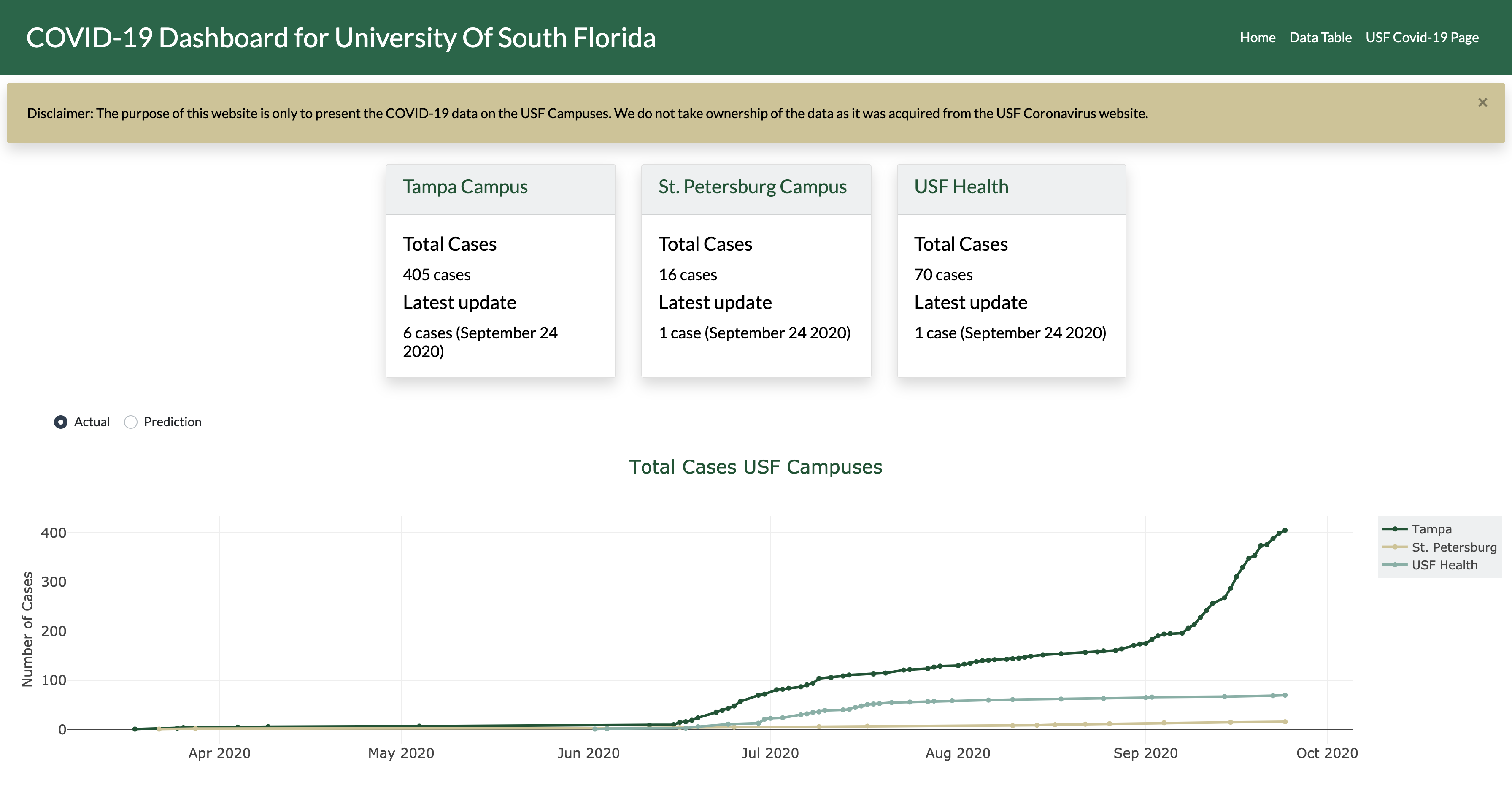
As a way to help the community better visualize the data, Shenoy and Flores Souza gathered data from the USF COVID-19 website and created interactive graphs and tables, ranging from bar graphs to box plots, showcasing the total number of cases, the percentage increase in cases and a comparison between the student and employee populations across campuses.
The website not only organizes the data in one place, but it also allows users to see the correlation, patterns and trends of positive cases reported by USF.
“It’s basically just so that people can see the correlation,” Shenoy said. “If you see on the graph, Sept. 7 is exactly the date from which it goes exponential. And what’s 14 days minus Sept. 7? It’s Aug. 24, and that was the first day of class.
“The [USF’s website] couldn’t really tell you all these things because it’s just saying there were eight cases today, six cases today, so you can’t see these things and so that’s the main reason we thought [the dashboard] was needed.”
All the data provided in the dashboard is updated every time a user accesses the website, according to Shenoy. Since USF does not provide an exact time when the cases are updated, Shenoy said they configured the dashboard so it reads USF’s COVID-19 website every time their dashboard is accessed.
“That’s all happening instantaneously,” Shenoy said. “Basically, every time any user logs on to the website, the website reads through the USF cases to see whether any updates have been made and if they have been made, it does the changes and then it updates the graphs.”
At first, Shenoy and Flores Souza created a dashboard to track COVID-19 cases around the world. However, after noticing the difficulty to interpret the COVID-19 cases from USF’s website, they decided to be the first to address the concerns many had.
“We started working on a world COVID-19 dashboard showing for every country, very similar,” Flores Souza said. “But we realized that there were so many projects about that, that we just used it to gain more experience and how to deal with websites. And then we were like, ‘could we work on a project that is going to be useful to someone?’ Working on a project that is better, feels better.
“So then, Adheesh and I had that idea of providing the same dashboard that we created, but for USF because we realized nobody actually did it. We just worked on it and in the end, it seems to be working and it’s really useful to people.”
For Shenoy, the most challenging part was to optimize the website’s speed so it provides information to its users simultaneously.
“We both have never really created something that people have actually used, so the most challenging part was to make it as fast as possible,” Shenoy said.
New features will be added to the dashboard throughout the semester to optimize the user experience, according to Flores Souza.
“There’re always going to be changes and, when we’re free, we’re going to be adding them but for now, the website is pretty functional. It shows enough information for people to know what’s happening,” Flores Souza said.
Based on the number of cases and the data reported, the dashboard also calculates future predictions on how the cases might be impacted across campuses. Shenoy said the predictions are updated on a monthly basis to reflect the number of cases reported.
For Flores Souza, the intent was to make the website as accessible for users as possible so they could better visualize and interpret the data.
“We also had the intent to show the website as something very simple and then add more complex graphs for people that are actually really interested in learning more.”
“There were a lot of people who were oblivious about the number of cases or what’s actually happening because the cases are really hidden. It’s a long text and people don’t really read that, so that’s the idea.”
More Stories

USF’s presidential search slowed in spring, now resumes with new firm
The USF presidential search committee announced this month its plans to move forward with a new search firm in its pursuit of a new university president. In May, USF spokesperson Althea Johnson told The Oracle that USF would move forward with its presidential search after its initial search firm — SP&A Executive Search — finished […]

USF rocket team takes flight in NASA competition despite challenges
In a field in Alabama, USF Society of Aeronautics and Rocketry members waited for Prometheus — the rocket they’d spent nine months crafting — to take flight. USF’s SOAR was among the 53 teams that launched their rockets for the NASA Student Launch in Huntsville on May 4. The USF team placed 18th after launching […]

USF international students navigate travel under new visa limitations
With a ban restricting visa issuance and entry into the U.S. in effect, USF student Arshia Esmaeilian said he is afraid his parents might not be able to see him graduate next year unless the ban is lifted. “I didn’t really ask for this,” said Esmaeilian, a senior chemistry major. “It’s just something I have […]

USF’s Marshall Student Center to reduce hours amid budget constraints
USF’s Marshall Student Center will operate under reduced hours starting in the upcoming fall semester. New operating hours will go into effect starting on Aug. 17 as listed below: Monday–Thursday: Changing from 7 a.m.–midnight to 8 a.m.–11 p.m. Friday: Changing from 7 a.m.–1 a.m. to 8 a.m.–midnight Saturday: Changing from 8 a.m.–1 a.m. to 8 […]

USF, Crisis Center step up hurricane prep as anxiety lingers from last season
With the arrival of hurricane season in Tampa, USF students – particularly those new to South Florida – may be experiencing increased stress or anxiety after the 2024 season. Running from June 1 to Nov. 30, hurricane season marks the period when tropical storms form and intensify in the Atlantic Ocean, according to the National […]

Hillsborough County to explore building sports complex at MOSI site
Another development project could soon be in the works at a rapidly changing area in Tampa. Hillsborough County Commissioners voted unanimously on May 7 to prioritize building an indoor sports complex at the Museum of Science and Industry site on Fowler Avenue. Though still in its early stages, the MOSI CEO and Temple Terrace mayor […]