Loads of paint and a little debate
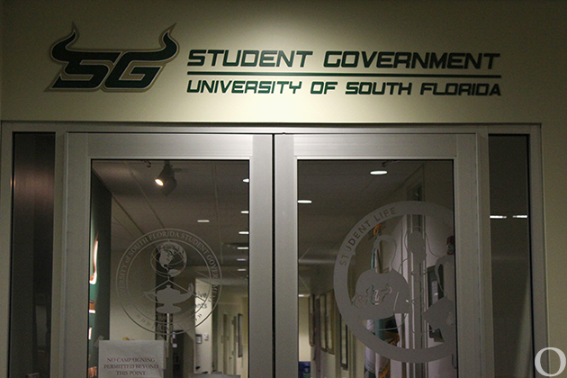
USF’s new face to the world — its new “professional” grade logo — is not nearly as colorful as the debate it has sparked on campus.
The university sees the new logo as a means to attract a higher-caliber student. But some think the logo is bland.
Either way, one thing is certain: The school will need loads of paint to spread its new brand across its campuses. The old logo left its mark on the floor of the Sun Dome, the university’s landmark water tower, Bull Runner shuttles and hundreds of directional signs on all of USF’s campuses.
The university has said — in keeping with another round of budget cuts — it would limit spending to thousands, rather than tens of thousands of dollars. Furthermore, officials say, the implementation of the new logo will be spread out over the course of years to come.
The quiet unveiling of USF’s new logo in May seems to have prompted more questions than praise from some in the USF community.
“The subject of the logo change came up in one of my classes and hardly anybody knew about it,” said Shea Showalter, a mass communications major. “I like it though; it looks more professional.”
Mark Rametta, a former USF sociology professor, shares Showalter’s view that the new logo looks more professional. He said he likes it better than the old one, but said a better logo would be one that was more contemporary and unique.
“Although I think the old one looked seventies-ish, I think the new one is kind of a generic looking logo; it looks like a University of Phoenix logo,” Rametta said. “But, USF is going into new territory, now attracting more students from out-of-state, and I think they are going in the right direction with it.”
Although there is not a set agenda for attracting out-of-state students, attracting a different kind of student is exactly what USF is attempting. According to the university’s Strategic Plan that was developed in the spring of 2001 for the 2002-07 school years, one of its top goals is to enhance the enrollment profile of the research university by increasing the number of freshmen college students who are in the top 20 percentile of their high school class. Administrators see the new-look logo as part of this strategy.
USF has requested more than $5.5 million from the state Legislature to pursue its goals in the 2003-04 academic year, though changing the university mark isn’t mentioned in the proposal.
And money has not been set aside solely for the logo change. Instead, according to Michael Reich, director of media relations, the phased approach used to implement the logo change will offset its cost.
USF insists that any costs related to the changes in the university’s visual identity is being kept at a minimum during a time of tuition and other increases.
“We wanted to do this in a way that was most fiscally responsible,” Reich said. “We will be spending in the thousands instead of in the tens of thousands.”
Still, many question why the change was necessary at all.
“We are a national research institution now,” said Carlene Brown, marketing coordinator of media relations.
Others questioned the perceived association between conservative colors in university logos and academic reputation.
“What about (the University of) Florida?” said Jennefer Castellano, who received her Public Relations degree from USF. “Florida’s colors are bright orange and bright blue and they are a very respected research university.”
While repainting the water tower and Sun Dome floor is a priority, items such as a stationary can be changed gradually.
“We’ll be using up what’s left and then re-ordering,” Reich said.
Logo changes at USF are not limited to its academic side. USF athletics plans to unveil a new bull logo in the near future.
“We will be unveiling a new athletic logo later this month,” said Tom Veit, associate director of athletics. “We’re doing the logo now because this is the time the uniforms are changing.”
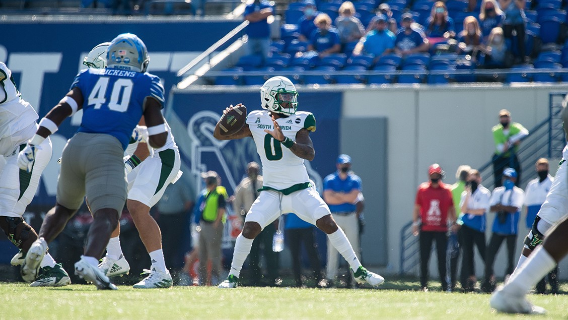
USF will enter a conference for the first time in its 7-year history when it plays in Conference USA this season. It was Athletic Director Lee Roy Selmon’s decision to change the athletic mark, Veit said. The Collegiate Licensing Company, with which the university will soon be affiliated, was consulted about the modification of the athletic logo from the “Iron Bull” to an as yet unrevealed logo.
“One of the reasons the logo is being changed is to make money,” Veit said. “Merchandise sales are projected to increase.”
For now, merchandise sales are increasing for at least one Tampa Bay area store, but for a different reason.
“People come in here looking for the USF hats with the old logo,” said Mike Hayes, an employee at Lids in Westfield Shoppingtown Brandon. “One girl came in here and said she had been looking around and no other stores have them. She bought like four or five of them.”
Hayes has been selling approximately five or six USF hats a week during his shifts since he began working there two months ago, he said. The store is not stocked with hats displaying the new university mark yet, but will send the hats carrying old logos to the clearance rack once they arrive.
“We’ll probably sell even more then,” Hayes said. “I’ve heard a lot of people don’t like the new (university) logo.”
In fact, many students are upset about the change and are showing much disdain for the new brand associated with the university.
“I hate it,” said Melanie Parker, a junior. “I like the squiggly ‘S.’ But, the new colors are more sophisticated and go with the new sophisticated look they are going for, I guess.”
The new colors may be more sophisticated, but they are definitely not unique. The University of San Francisco, the country’s other USF, is also branded with green and gold. To further the confusion, Veit said USF Athletics may even drop South Florida and be known simply and strictly as USF.
USF’s facelift should be completed within the year. The logo will also bring about more noticeable changes across the university’s campuses.
Signs adorned by the old logo complement most of the more than 400 buildings built upon USF’s campuses. These, and other directional signs similarly adorned, will need to be changed. Vehicle stickers will also have to be replaced. Additionally, painters will soon leave the school’s new mark on the water tower, although it is still questionable if they will do a sweep of the color scheme to rid USF’s campuses completely of the old yellow and adhere to the new school colors.
Rametta said he feels USF is jumping on UF’s path of success with its own top academic and athletic programs.
“Once USF gets an established football program and some good research going, people will be proud to have gone to USF,” Rametta said. “The logo isn’t so much for the students now, but for the future of USF.”


